Docs
Image
Overview
Use the image shortcode to display a responsive image with an optional aspect ratio. The source link can refer to either an image available in the /assets/img folder of your site or a public web location. The shortcode renders the image as a so-called
image set
to optimize the image for different screen sizes and resolutions.
Behind the scenes, Hugo renders the images in WebP format and stores them in a local folder (resources or public). The images are processed using the quality setting specified in the [imaging] section of the main
config file
(defaults to 75). Supported image types are .png, .jpeg, .gif, .tiff, .bmp, and .webp. A fallback image of type .jpeg is provided for older browsers.
Aspect ratio
As an example, the following shortcodes display a centered image with various aspect ratios.
Set the ratio to 1x1 for a square aspect ratio.

{{< image src="img/placeholder.png" ratio="1x1" wrapper="col-6 mx-auto" >}}Set the ratio to 3x1 for a landscape aspect ratio.

{{< image src="img/placeholder.png" ratio="3x1" wrapper="col-6 mx-auto" >}}Set the ratio to 3x2 for a landscape aspect ratio.

{{< image src="img/placeholder.png" ratio="3x2" wrapper="col-6 mx-auto" >}}Set the ratio to 4x3 for a landscape aspect ratio.

{{< image src="img/placeholder.png" ratio="4x3" wrapper="col-6 mx-auto" >}}Set the ratio to 16x9 for a landscape aspect ratio.

{{< image src="img/placeholder.png" ratio="16x9" wrapper="col-6 mx-auto" >}}Set the ratio to 21x9 for a landscape aspect ratio.

{{< image src="img/placeholder.png" ratio="21x9" wrapper="col-6 mx-auto" >}}Omit the ratio to keep the original aspect ratio.
{{< image src="img/placeholder.png" wrapper="col-6 mx-auto" >}}Color mode
Set mode to true to use an image that is color-mode aware. The shortcode processes two images behind the scenes, being img/responsive-light.png and img/responsive-dark.png. Only the image that matches the current color mode is shown.


{{< image src="img/responsive.png" mode="true" >}}Figures
Add a caption to transform the image into a figure with caption.
{{< image src="img/placeholder.png" wrapper="col-6 mx-auto" caption="Figure caption" >}}Vector images
The shortcode supports vector images of type .svg too. The shortcode supports the regular arguments, however, vector images are contained instead of cropped when the ratio is set. The next example shows a color-mode-aware vector image. The background is set to a contrasting color to illustrate the ratio behavior.
Important
Since release v0.26.3 , vector images stored in the site’s
assetsfolder are embedded as inline vector images. Vector images stored in thestaticfolder are kept as separate files.
{{< image src="/img/logo_var.svg#logo" class="img-fluid w-50" wrapper="text-center" >}}Static assets
Files stored in the site’s static folder are served as-is, without any image processing or resizing. This is required for formats where processing would alter the content, such as animated GIFs.
Note
Place the file in your site’s
staticfolder and reference it by its public path (e.g./img/animation.gif). Static files are detected automatically — no additional arguments are needed.
{{< image src="/img/cloudcannon-visual-editing.gif"
    wrapper="col-12 col-md-8 mx-auto border" >}}
DAM images
Hinode supports Cloudinary , ImageKit.io , and Imgix as Digital Asset Manager (DAM). You can configure these managers in your site parameters. Check out the DAM Configuration for more details.
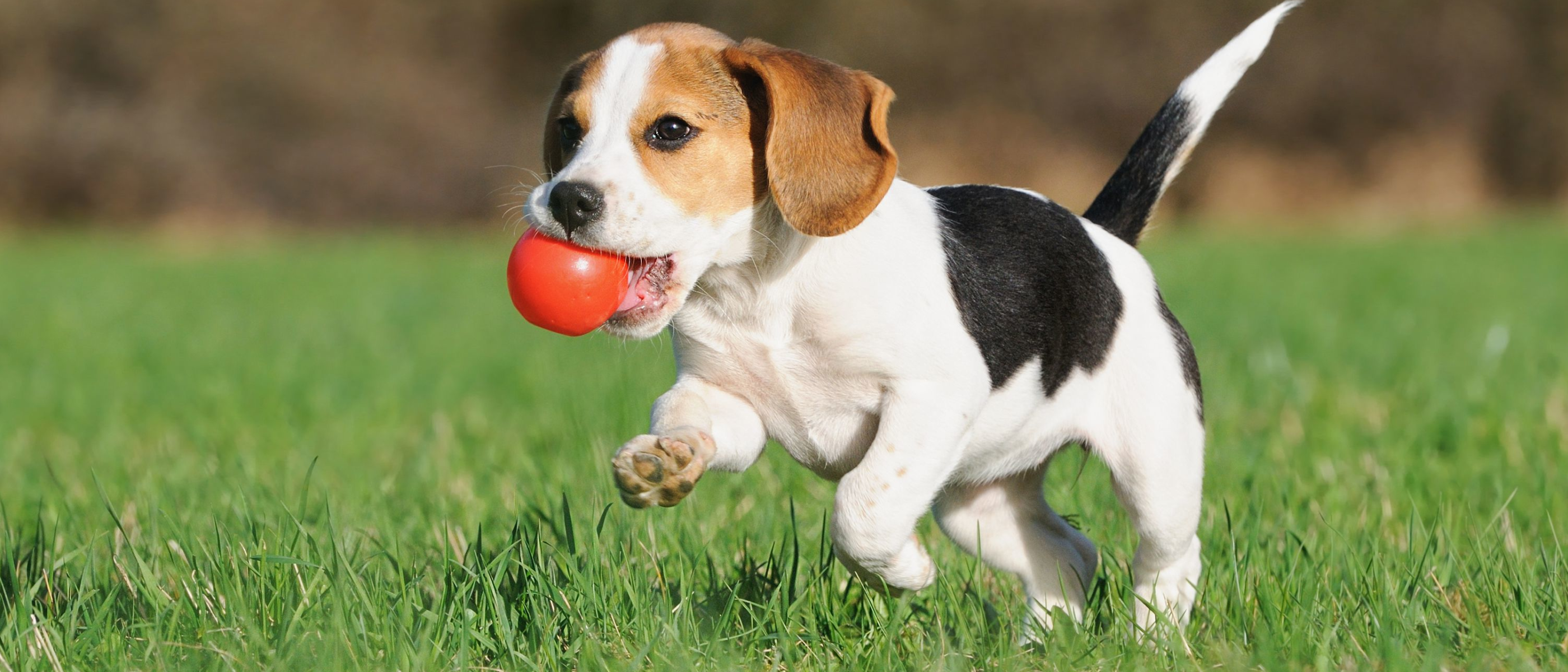
{{< image src="https://res.cloudinary.com/demo/image/upload/dog.webp"
ratio="21x9" caption="Cloudinary image" wrapper="col-12 col-md-8 mx-auto" >}}
{{< image src="https://ik.imagekit.io/demo/default-image.jpg"
ratio="21x9" caption="ImageKit.io image" wrapper="col-12 col-md-8 mx-auto" >}}
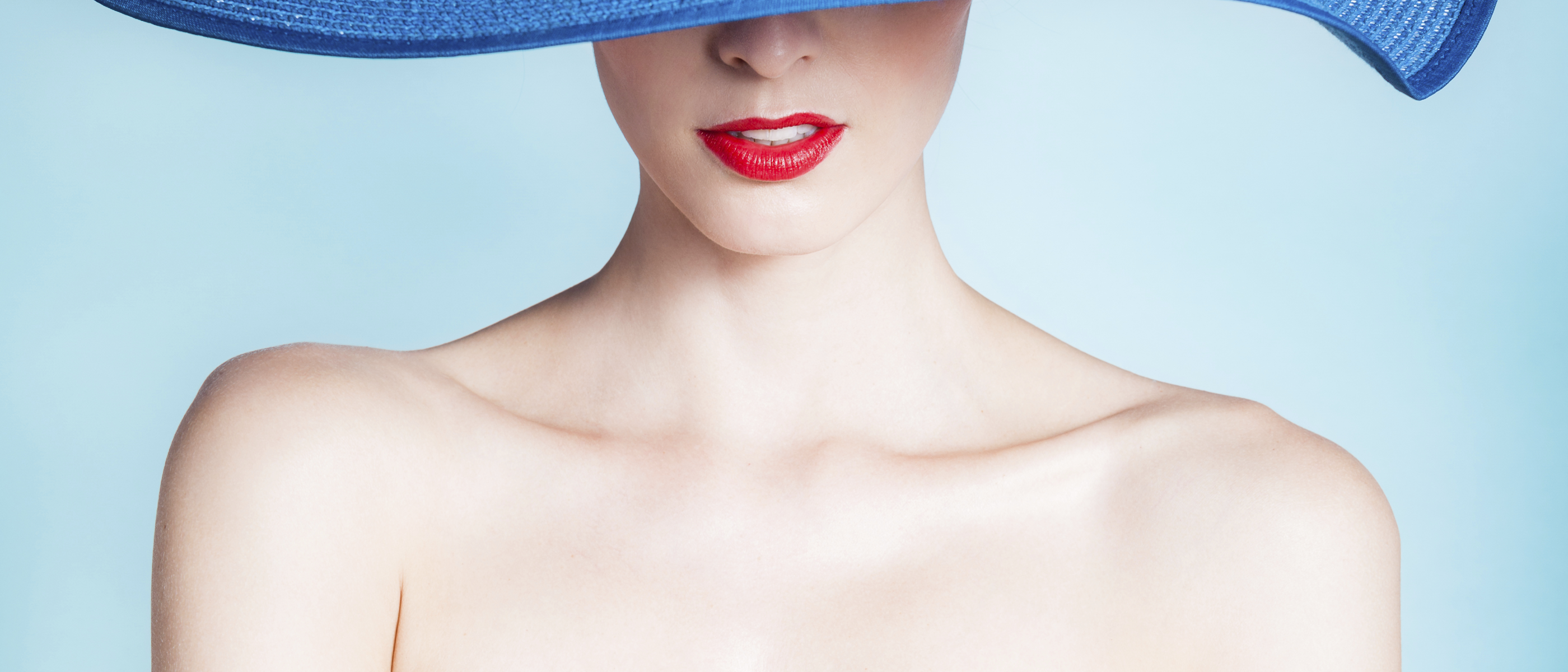
{{< image src="https://assets.imgix.net/examples/bluehat.jpg"
ratio="21x9" caption="imgix image" wrapper="col-12 col-md-8 mx-auto" >}}Cropped images
By default, images use Smart croppping. You can refine the image crop by setting the anchor. The following example shows this behavior as part of a
Card Group
.

TopLeft anchor
Top anchor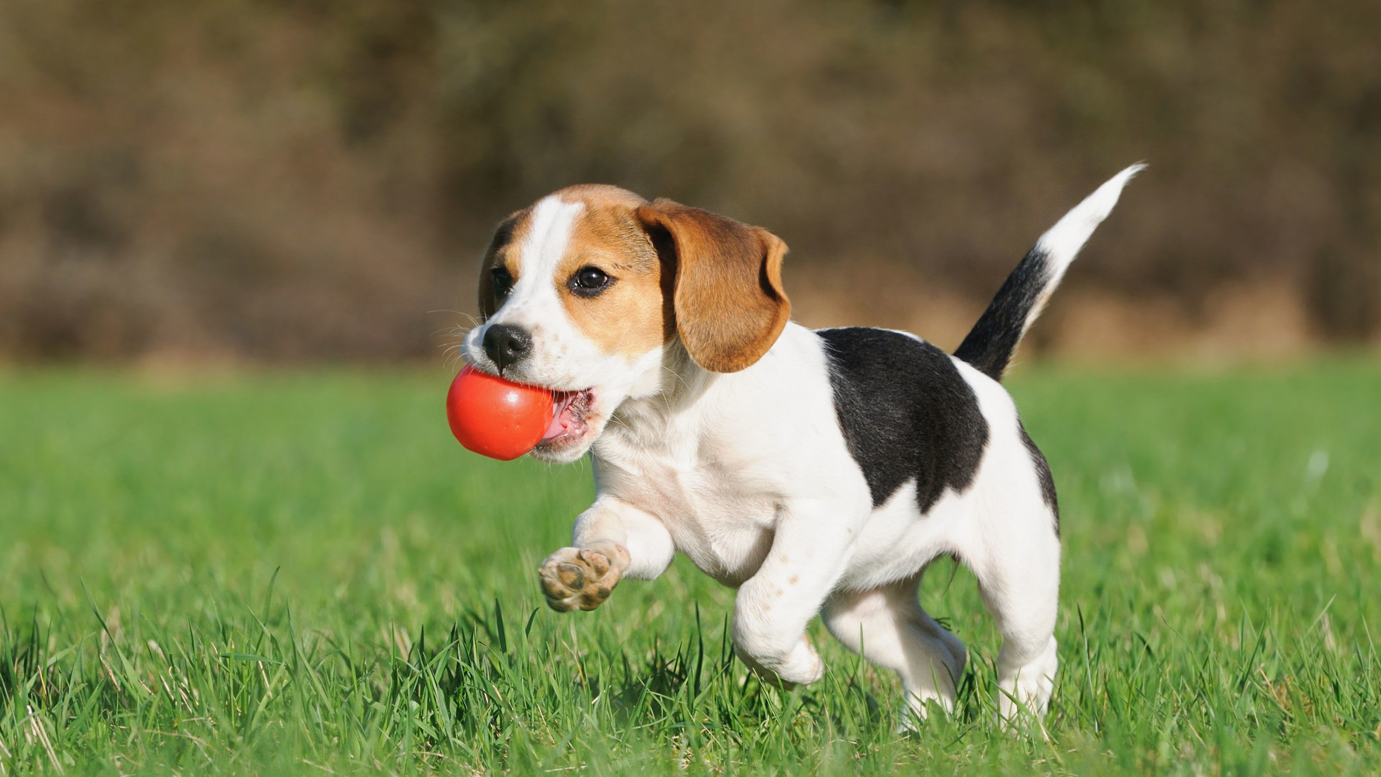
TopRight anchor
Left anchor
Center anchor
Right anchor
BottomLeft anchor
Bottom anchor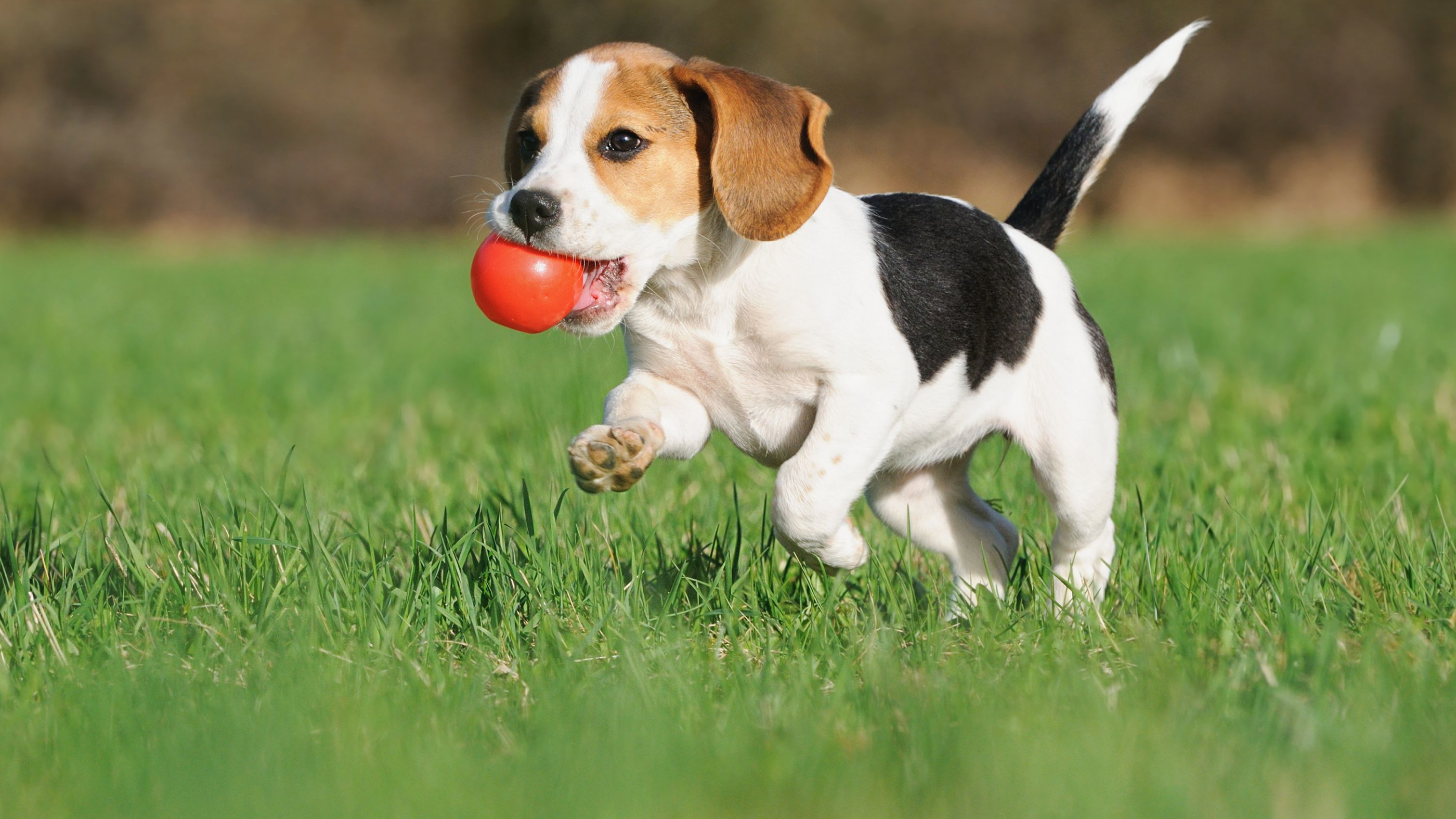
BottomRight anchor{{< card-group padding="3" gutter="3" cols=3 ratio="16x9" >}}
{{< card thumbnail="https://res.cloudinary.com/demo/image/upload/dog.webp" anchor="TopLeft" >}}
`TopLeft` anchor
{{< /card >}}
{{< card thumbnail="https://res.cloudinary.com/demo/image/upload/dog.webp" anchor="Top" >}}
`Top` anchor
{{< /card >}}
{{< card thumbnail="https://res.cloudinary.com/demo/image/upload/dog.webp" anchor="TopRight" >}}
`TopRight` anchor
{{< /card >}}
{{< card thumbnail="https://res.cloudinary.com/demo/image/upload/dog.webp" ratio="1x1" anchor="Left" >}}
`Left` anchor
{{< /card >}}
{{< card thumbnail="https://res.cloudinary.com/demo/image/upload/dog.webp" ratio="1x1" anchor="Center" >}}
`Center` anchor
{{< /card >}}
{{< card thumbnail="https://res.cloudinary.com/demo/image/upload/dog.webp" ratio="1x1" anchor="Right" >}}
`Right` anchor
{{< /card >}}
{{< card thumbnail="https://res.cloudinary.com/demo/image/upload/dog.webp" anchor="BottomLeft" >}}
`BottomLeft` anchor
{{< /card >}}
{{< card thumbnail="https://res.cloudinary.com/demo/image/upload/dog.webp" anchor="Bottom" >}}
`Bottom` anchor
{{< /card >}}
{{< card thumbnail="https://res.cloudinary.com/demo/image/upload/dog.webp" anchor="BottomRight" >}}
`BottomRight` anchor
{{< /card >}}
{{< /card-group >}}Styling
The file assets/scss/components/_img.scss defines the Hinode-specific styling of the img shortcode.
.img-wrap {
    overflow: hidden;
    position: relative;
}

.img-wrap img {
    height: 100%;
    width: 100%;
    object-fit: cover;
}

.card-img-h100 {
    width: auto;
    height: 100%;
    object-fit: cover;
}

.mirrorred {
    -webkit-transform: scaleX(-1);
    transform: scaleX(-1);
}

.background-img {
    --overlay-offset: #{$overlay-offset};

    height: calc(100vh - var(--overlay-offset));
    width: 100vw;
    object-fit: cover;
}

.figure-caption {
    margin-left: #{$theme-border-radius};
}Arguments
The shortcode supports the following arguments:
| Name | Type | Required | Default | Comment |
|---|---|---|---|---|
| anchor | select |
v0.24.22
Anchor of the image’s crop box, defaults to anchor value set in imaging section of the site configuration (usually Smart). Supported values: [TopLeft, Top, TopRight, Left, Center, Right, BottomLeft, Bottom, BottomRight, Smart]. |
||
v0.24.22
Anchor of the image’s crop box, defaults to anchor value set in imaging section of the site configuration (usually Smart). Supported values: [TopLeft, Top, TopRight, Left, Center, Right, BottomLeft, Bottom, BottomRight, Smart]. |
||||
| caption | string | Caption of the carousel slide or illustration. | ||
| Caption of the carousel slide or illustration. | ||||
| class | string | Class attributes of the element. It supports Bootstrap attributes to modify the styling of the element. | ||
| Class attributes of the element. It supports Bootstrap attributes to modify the styling of the element. | ||||
| figclass | string |
v0.23.0
Class attribute of the figure caption, e.g. px-4. |
||
v0.23.0
Class attribute of the figure caption, e.g. px-4. |
||||
| image-height | int | v1.0.0 Height of the image in pixels. | ||
| v1.0.0 Height of the image in pixels. | ||||
| image-width | int | v1.0.0 Width of the image in pixels. | ||
| v1.0.0 Width of the image in pixels. | ||||
| loading | select | eager |
v0.21.0
Image loading behavior. The loading of lazily loaded images is deferred until the image is within scrolling range of the viewport. This should reduce the initial loading time of the website. It is recommended to lazily load only those images that are below the page fold. Supported values: [lazy, eager]. |
|
v0.21.0
Image loading behavior. The loading of lazily loaded images is deferred until the image is within scrolling range of the viewport. This should reduce the initial loading time of the website. It is recommended to lazily load only those images that are below the page fold. Supported values: [lazy, eager]. |
||||
| mode | bool | Flag indicating if the media asset should support color modes. If set, the element searches for images having a matching color-mode suffix such as -light or -dark. |
||
Flag indicating if the media asset should support color modes. If set, the element searches for images having a matching color-mode suffix such as -light or -dark. |
||||
| plain | bool | v0.24.0 Flag to indicate if the current element should be rendered as plain. For image, this implies no transformations are applied. For navbar items, this ignores any children. | ||
| v0.24.0 Flag to indicate if the current element should be rendered as plain. For image, this implies no transformations are applied. For navbar items, this ignores any children. | ||||
| portrait | bool | v0.18.3 Flag to adjust the image ratio from landscape to portrait. The image itself is not rotated, only the crop area is adjusted. Not applicable to vector graphics. | ||
| v0.18.3 Flag to adjust the image ratio from landscape to portrait. The image itself is not rotated, only the crop area is adjusted. Not applicable to vector graphics. | ||||
| ratio | select | Ratio of the media asset. When the asset is an image, it is resized and cropped (not applicable to vector graphics). For video assets, the padding of the embedded frame is adjusted. When set to auto, the original aspect ratio is used. Supported values: [1x1, 3x1, 3x2, 4x3, 16x9, 21x9, auto]. |
||
Ratio of the media asset. When the asset is an image, it is resized and cropped (not applicable to vector graphics). For video assets, the padding of the embedded frame is adjusted. When set to auto, the original aspect ratio is used. Supported values: [1x1, 3x1, 3x2, 4x3, 16x9, 21x9, auto]. |
||||
| src | string | Path or url of the image, e.g. img/example.jpg. Images with multiple color modes are expected to have a basename that ends with either -dark or -light. |
||
Path or url of the image, e.g. img/example.jpg. Images with multiple color modes are expected to have a basename that ends with either -dark or -light. |
||||
| title | string, hstring.RenderedString, hstring.HTML, template.HTML | Title of the element. If the element references a (local) page, the title overrides the referenced page’s title. | ||
| Title of the element. If the element references a (local) page, the title overrides the referenced page’s title. | ||||
| url | string, template.URL |
v1.0.0
Use src instead. Path or url of the image, e.g. img/example.jpg. Images with multiple color modes are expected to have a basename that ends with either -dark or -light. |
||
v1.0.0
Use src instead. Path or url of the image, e.g. img/example.jpg. Images with multiple color modes are expected to have a basename that ends with either -dark or -light. |
||||
| wrapper | string |
v0.18.3
Class attribute of the element’s wrapper. It supports Bootstrap attributes to modify the styling of the element. Icons include the fa-wrapper and fa-fluid attributes by default. |
||
v0.18.3
Class attribute of the element’s wrapper. It supports Bootstrap attributes to modify the styling of the element. Icons include the fa-wrapper and fa-fluid attributes by default. |
||||