Docs
CTA
10 min read • 1,991 wordsOverview
The cta content block renders a call to action section. You can include an optional contact or provide your own content. By default, the cta uses a generic title and message. Set the heading attribute to override these values.
Interested in This Topic?
- _bookshop_name: cta
  contact: Betty White
  caption-url: #!
  background:
    color: primary
    subtle: true
  order: first
  links:
    - title: Get in touch
      url: '#!'
      icon: fas chevron-right
Arguments
The content block supports the following arguments:
| Name | Type | Required | Default | Comment |
|---|---|---|---|---|
| _bookshop_name | string | Unique name of the bookshop component. | ||
| _ordinal | int | Zero-based position of the bookshop component within the page’s component hierarchy. | ||
| align | select | start |
Alignment of the headline, content, or icon. Supported values: [start, center, end]. |
|
| background | background, string | Background style of the section. | ||
| caption-url | string, template.URL | Address of the caption destination, either a local reference or an external address. Include the scheme when referencing an external address, such as https://google.com. Local references may include an optional anchor link such as blog/bootstrap-elements/#docs. |
||
| contact | string | The full name of the contact to retrieve. | ||
| cover | bool | true |
Flag indicating if the element should be rendered fullscreen. | |
| fluid | bool | true |
Flag to set the section container to fluid design, else the section is limited to xxl. |
|
| heading | Heading | Heading of the content block, including a preheading and content element. | ||
| id | string | Unique identifier of the current element. | ||
| illustration | Illustration | Featured illustration of the element. | ||
| links | links, []map[string]interface {} | Links to add as buttons. | ||
| order | select | last |
Order of the illustration. Supported values: [first, last]. |
|
| padding | int | 3 |
Padding of the content. | |
| theme | select | Color theme to apply to the element. Supported values: [light, dark]. |
||
| width | int | 8 |
Column width of the element. For embedded elements, the width is relative to the parent’s container. |
| Name | Type | Required | Default |
|---|---|---|---|
| _bookshop_name | string | ||
| Unique name of the bookshop component. | |||
| _ordinal | int | ||
| Zero-based position of the bookshop component within the page’s component hierarchy. | |||
| align | select | start |
|
Alignment of the headline, content, or icon. Supported values: [start, center, end]. |
|||
| background | background, string | ||
| Background style of the section. | |||
| caption-url | string, template.URL | ||
Address of the caption destination, either a local reference or an external address. Include the scheme when referencing an external address, such as https://google.com. Local references may include an optional anchor link such as blog/bootstrap-elements/#docs. |
|||
| contact | string | ||
| The full name of the contact to retrieve. | |||
| cover | bool | true |
|
| Flag indicating if the element should be rendered fullscreen. | |||
| fluid | bool | true |
|
Flag to set the section container to fluid design, else the section is limited to xxl. |
|||
| heading | Heading | ||
| Heading of the content block, including a preheading and content element. | |||
| id | string | ||
| Unique identifier of the current element. | |||
| illustration | Illustration | ||
| Featured illustration of the element. | |||
| links | links, []map[string]interface {} | ||
| Links to add as buttons. | |||
| order | select | last |
|
Order of the illustration. Supported values: [first, last]. |
|||
| padding | int | 3 |
|
| Padding of the content. | |||
| theme | select | ||
Color theme to apply to the element. Supported values: [light, dark]. |
|||
| width | int | 8 |
|
| Column width of the element. For embedded elements, the width is relative to the parent’s container. | |||
Background Type
| Name | Type | Required | Default | Comment |
|---|---|---|---|---|
| backdrop | string | Background image with a mask to improve contrast. | ||
| color | select | Theme color of the element. Supported values: [primary, secondary, success, danger, warning, info, light, dark, white, black, body, body-tertiary]. |
||
| subtle | bool | Apply subtle theme colors. |
| Name | Type | Required | Default |
|---|---|---|---|
| backdrop | string | ||
| Background image with a mask to improve contrast. | |||
| color | select | ||
Theme color of the element. Supported values: [primary, secondary, success, danger, warning, info, light, dark, white, black, body, body-tertiary]. |
|||
| subtle | bool | ||
| Apply subtle theme colors. | |||
Heading Type
| Name | Type | Required | Default | Comment |
|---|---|---|---|---|
| align | select | start |
Alignment of the headline, content, or icon. Supported values: [start, center, end]. |
|
| arrangement | select | above |
Arrangement of the preheading, either left or above the header. On smaller screens, the preheading is always placed on top. Supported values: [above, first]. |
|
| content | string, template.HTML | Section content displayed below the title. | ||
| preheading | string | Preheading of the section heading. | ||
| size | int | 4 |
Display size of the headline. | |
| title | string, hstring.RenderedString, hstring.HTML, template.HTML | Title of the element. If the element references a (local) page, the title overrides the referenced page’s title. | ||
| width | int | 8 |
Column width of the element. For embedded elements, the width is relative to the parent’s container. |
| Name | Type | Required | Default |
|---|---|---|---|
| align | select | start |
|
Alignment of the headline, content, or icon. Supported values: [start, center, end]. |
|||
| arrangement | select | above |
|
Arrangement of the preheading, either left or above the header. On smaller screens, the preheading is always placed on top. Supported values: [above, first]. |
|||
| content | string, template.HTML | ||
| Section content displayed below the title. | |||
| preheading | string | ||
| Preheading of the section heading. | |||
| size | int | 4 |
|
| Display size of the headline. | |||
| title | string, hstring.RenderedString, hstring.HTML, template.HTML | ||
| Title of the element. If the element references a (local) page, the title overrides the referenced page’s title. | |||
| width | int | 8 |
|
| Column width of the element. For embedded elements, the width is relative to the parent’s container. | |||
Illustration Type
| Name | Type | Required | Default | Comment |
|---|---|---|---|---|
| anchor | select | Anchor of the image’s crop box, defaults to anchor value set in imaging section of the site configuration (usually Smart). Supported values: [TopLeft, Top, TopRight, Left, Center, Right, BottomLeft, Bottom, BottomRight, Smart]. |
||
| caption | string | Caption of the carousel slide or illustration. | ||
| caption-url | string, template.URL | Address of the caption destination, either a local reference or an external address. Include the scheme when referencing an external address, such as https://google.com. Local references may include an optional anchor link such as blog/bootstrap-elements/#docs. |
||
| class | string | Class attributes of the element. It supports Bootstrap attributes to modify the styling of the element. | ||
| hook | string | Render hook for the element’s partial. | ||
| icon | string | Icon to include. You can use shorthand notation such as fas sort to include a Font Awesome icon. The argument also supports files with an .svg or .json extension. |
||
| image | string | Image to include in the the content block or section heading. | ||
| image-overlay | bool | Trigger to include an image overlay placeholder. | ||
| justify | select | start |
Justification of the child elements. Supported values: [start, end, center, between, around, evenly]. |
|
| mode | bool | Flag indicating if the media asset should support color modes. If set, the element searches for images having a matching color-mode suffix such as -light or -dark. |
||
| ratio | select | Ratio of the media asset. When the asset is an image, it is resized and cropped (not applicable to vector graphics). For video assets, the padding of the embedded frame is adjusted. When set to auto, the original aspect ratio is used. Supported values: [1x1, 3x2, 4x3, 16x9, 21x9, auto]. |
||
| width | int | 8 |
Column width of the element. For embedded elements, the width is relative to the parent’s container. |
| Name | Type | Required | Default |
|---|---|---|---|
| anchor | select | ||
Anchor of the image’s crop box, defaults to anchor value set in imaging section of the site configuration (usually Smart). Supported values: [TopLeft, Top, TopRight, Left, Center, Right, BottomLeft, Bottom, BottomRight, Smart]. |
|||
| caption | string | ||
| Caption of the carousel slide or illustration. | |||
| caption-url | string, template.URL | ||
Address of the caption destination, either a local reference or an external address. Include the scheme when referencing an external address, such as https://google.com. Local references may include an optional anchor link such as blog/bootstrap-elements/#docs. |
|||
| class | string | ||
| Class attributes of the element. It supports Bootstrap attributes to modify the styling of the element. | |||
| hook | string | ||
| Render hook for the element’s partial. | |||
| icon | string | ||
Icon to include. You can use shorthand notation such as fas sort to include a Font Awesome icon. The argument also supports files with an .svg or .json extension. |
|||
| image | string | ||
| Image to include in the the content block or section heading. | |||
| image-overlay | bool | ||
| Trigger to include an image overlay placeholder. | |||
| justify | select | start |
|
Justification of the child elements. Supported values: [start, end, center, between, around, evenly]. |
|||
| mode | bool | ||
Flag indicating if the media asset should support color modes. If set, the element searches for images having a matching color-mode suffix such as -light or -dark. |
|||
| ratio | select | ||
Ratio of the media asset. When the asset is an image, it is resized and cropped (not applicable to vector graphics). For video assets, the padding of the embedded frame is adjusted. When set to auto, the original aspect ratio is used. Supported values: [1x1, 3x2, 4x3, 16x9, 21x9, auto]. |
|||
| width | int | 8 |
|
| Column width of the element. For embedded elements, the width is relative to the parent’s container. | |||
Links Type
| Name | Type | Required | Default | Comment |
|---|---|---|---|---|
| force | bool | Flag to indicate a link should bypass any language redirection. Only applicable when the site param enableLanguageSelectionStorage is set to true. When force is true, the link to a local page is kept as is. |
||
| icon | string | Icon to include. You can use shorthand notation such as fas sort to include a Font Awesome icon. The argument also supports files with an .svg or .json extension. |
||
| title | string, hstring.RenderedString, hstring.HTML, template.HTML | Title of the element. If the element references a (local) page, the title overrides the referenced page’s title. | ||
| url | string, template.URL | Address of the link destination, either a local reference or an external address. Include the scheme when referencing an external address, such as https://google.com. Local references may include an optional anchor link such as blog/bootstrap-elements/#docs. |
| Name | Type | Required | Default |
|---|---|---|---|
| force | bool | ||
Flag to indicate a link should bypass any language redirection. Only applicable when the site param enableLanguageSelectionStorage is set to true. When force is true, the link to a local page is kept as is. |
|||
| icon | string | ||
Icon to include. You can use shorthand notation such as fas sort to include a Font Awesome icon. The argument also supports files with an .svg or .json extension. |
|||
| title | string, hstring.RenderedString, hstring.HTML, template.HTML | ||
| Title of the element. If the element references a (local) page, the title overrides the referenced page’s title. | |||
| url | string, template.URL | ||
Address of the link destination, either a local reference or an external address. Include the scheme when referencing an external address, such as https://google.com. Local references may include an optional anchor link such as blog/bootstrap-elements/#docs. |
|||
Data Format
Tip
Make the background of the contact’s image transparent to improve rendering in dark mode and light mode.
Define a file in the data folder that contains the contacts data. The format supports the following attributes:
| Attribute | Required | Description |
|---|---|---|
| name | Yes | Full name of the contact, e.g. Betty White. |
| preferred | No | Preferred name of the contact, e.g. Betty. |
| image | No | Path or url of the image, e.g. img/betty.png. |
| function | No | Function title of the contact. |
| No | URL of the contact’s LinkedIn profile. | |
| keywords | No | Keywords to associate with the contact. |
| biography | No | Biography of the contact. |
The following snippet defines a single contact in yml format.
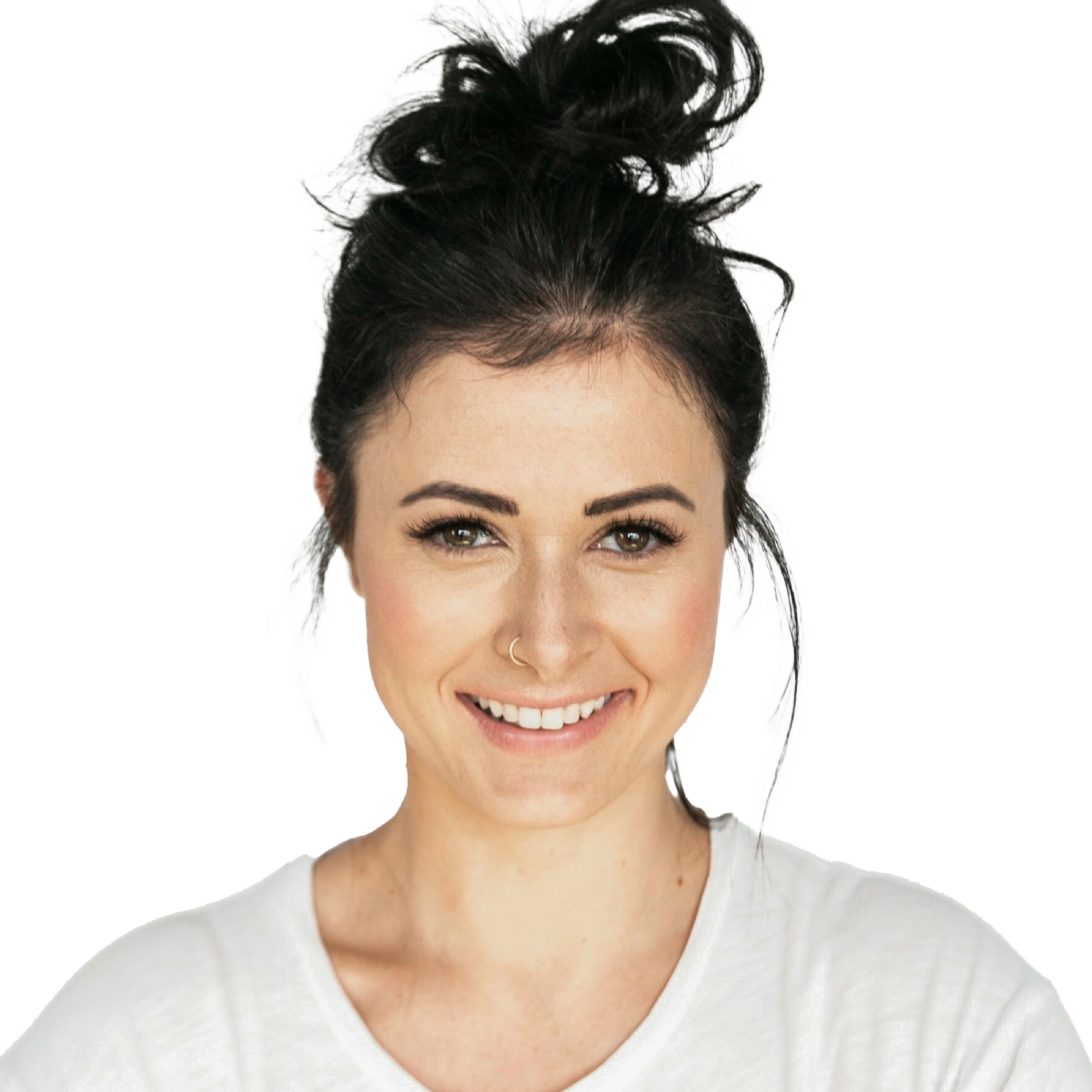
- name: Betty White
  preferred: Betty
  image: /img/jake-nackos-IF9TK5Uy-KI-unsplash.png
  function: UX Expert
  linkedin: https://www.linkedin.com
  keywords:
    - experience
  biography: >-
    Duis rutrum, justo eleifend sagittis facilisis, leo orci hendrerit elit, ac
    tristique nisl justo non neque.
Examples
Change the style of your call to action block with the available arguments.
Auto-Populated
Set the contact name to auto-populate the cta fields using the available contact data.
Interested in This Topic?
- _bookshop_name: cta
  contact: Betty White
  caption-url: /docs/content-blocks/cta/
  background:
    color: primary
    subtle: true
  order: first
  links:
    - title: Get in touch
      url: '#!'
      icon: fas chevron-right
Custom Content
Define the heading and illustration attributes to create a custom CTA.

- _bookshop_name: cta
  heading:
    title: Join our webinar
    content: Join our webinar to discover how Hugo can help you create fast and secure websites.
    width: 8
  illustration:
    image: /img/nat-9l98kFByiao-unsplash.jpg
    ratio: 1x1
  background:
    color: primary
    subtle: true
  order: first
  links:
    - title: Register
      url: '#!'
      icon: fas chevron-right