Docs
Panels
8 min read • 1,551 wordsUse the panels content block to display multiple toggable panels.
Overview
The panels content block displays multiple panels that are toggled by a tab control.
Preheading
Heading
Panels content. It supports multiple lines.


yml
- _bookshop_name: panels
heading:
preheading: Preheading
title: Heading
content: Panels content. It supports multiple lines.
align: start
background:
color: primary
subtle: true
width: 12
tab-type: underline
ratio: 1x1
elements:
- title: First Panel
image: /img/sunrise.jpg
content: content 1
- title: Second Panel
image: /img/nat-9l98kFByiao-unsplash.jpg
content: content 2
- title: Third Panel
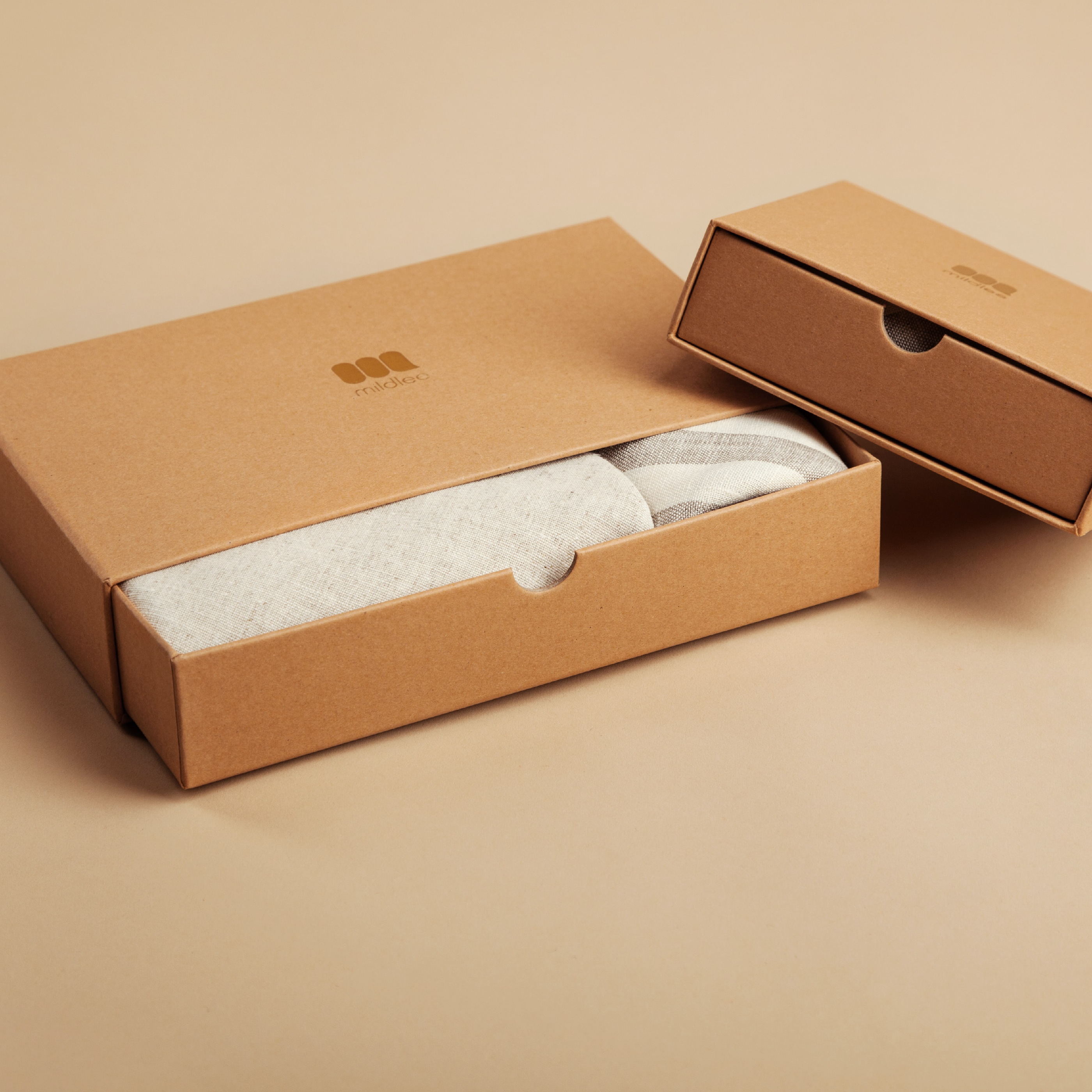
image: /img/packages.jpg
content: content 3Arguments
The content block supports the following arguments:
| Name | Type | Required | Default | Comment |
|---|---|---|---|---|
| _bookshop_name | string | Unique name of the bookshop component. | ||
| _ordinal | int | Zero-based position of the bookshop component within the page’s component hierarchy. | ||
| background | background, string | Background style of the section. | ||
| class | string | Class attributes of the element. It supports Bootstrap attributes to modify the styling of the element. | ||
| cols | int | 3 |
Number of grid columns. | |
| cover | bool | true |
Flag indicating if the element should be rendered fullscreen. | |
| elements | [] Elements | yes | Elements to include in the card group. Each element is rendered as a card. | |
| fluid | bool | true |
Flag to set the section container to fluid design, else the section is limited to xxl. |
|
| heading | Heading | Heading of the content block, including a preheading and content element. | ||
| id | string | Unique identifier of the current element. | ||
| justify | select | start |
Justification of the child elements. Supported values: [start, end, center, between, around, evenly]. |
|
| padding | int | 3 |
Padding of the content. | |
| ratio | select | Ratio of the media asset. When the asset is an image, it is resized and cropped (not applicable to vector graphics). For video assets, the padding of the embedded frame is adjusted. When set to auto, the original aspect ratio is used. Supported values: [1x1, 3x2, 4x3, 16x9, 21x9, auto]. |
||
| responsive | bool | true |
Flag indicating if the element should be responsive. | |
| tab-type | select | Type of the tab group. Supported values: [tabs, pills, underline, callout]. |
||
| theme | select | Color theme to apply to the element. Supported values: [light, dark]. |
||
| width | int | 8 |
Column width of the element. For embedded elements, the width is relative to the parent’s container. |
| Name | Type | Required | Default |
|---|---|---|---|
| _bookshop_name | string | ||
| Unique name of the bookshop component. | |||
| _ordinal | int | ||
| Zero-based position of the bookshop component within the page’s component hierarchy. | |||
| background | background, string | ||
| Background style of the section. | |||
| class | string | ||
| Class attributes of the element. It supports Bootstrap attributes to modify the styling of the element. | |||
| cols | int | 3 |
|
| Number of grid columns. | |||
| cover | bool | true |
|
| Flag indicating if the element should be rendered fullscreen. | |||
| elements | [] Elements | yes | |
| Elements to include in the card group. Each element is rendered as a card. | |||
| fluid | bool | true |
|
Flag to set the section container to fluid design, else the section is limited to xxl. |
|||
| heading | Heading | ||
| Heading of the content block, including a preheading and content element. | |||
| id | string | ||
| Unique identifier of the current element. | |||
| justify | select | start |
|
Justification of the child elements. Supported values: [start, end, center, between, around, evenly]. |
|||
| padding | int | 3 |
|
| Padding of the content. | |||
| ratio | select | ||
Ratio of the media asset. When the asset is an image, it is resized and cropped (not applicable to vector graphics). For video assets, the padding of the embedded frame is adjusted. When set to auto, the original aspect ratio is used. Supported values: [1x1, 3x2, 4x3, 16x9, 21x9, auto]. |
|||
| responsive | bool | true |
|
| Flag indicating if the element should be responsive. | |||
| tab-type | select | ||
Type of the tab group. Supported values: [tabs, pills, underline, callout]. |
|||
| theme | select | ||
Color theme to apply to the element. Supported values: [light, dark]. |
|||
| width | int | 8 |
|
| Column width of the element. For embedded elements, the width is relative to the parent’s container. | |||
Background Type
| Name | Type | Required | Default | Comment |
|---|---|---|---|---|
| backdrop | string | Background image with a mask to improve contrast. | ||
| color | select | Theme color of the element. Supported values: [primary, secondary, success, danger, warning, info, light, dark, white, black, body, body-tertiary]. |
||
| subtle | bool | Apply subtle theme colors. |
| Name | Type | Required | Default |
|---|---|---|---|
| backdrop | string | ||
| Background image with a mask to improve contrast. | |||
| color | select | ||
Theme color of the element. Supported values: [primary, secondary, success, danger, warning, info, light, dark, white, black, body, body-tertiary]. |
|||
| subtle | bool | ||
| Apply subtle theme colors. | |||
Elements Type
| Name | Type | Required | Default | Comment |
|---|---|---|---|---|
| content | string, template.HTML | Section content displayed below the title. | ||
| icon | string | Icon to include. You can use shorthand notation such as fas sort to include a Font Awesome icon. The argument also supports files with an .svg or .json extension. |
||
| image | string | Image to include in the the content block or section heading. | ||
| mode | bool | Flag indicating if the media asset should support color modes. If set, the element searches for images having a matching color-mode suffix such as -light or -dark. |
||
| title | string, hstring.RenderedString, hstring.HTML, template.HTML | Title of the element. If the element references a (local) page, the title overrides the referenced page’s title. |
| Name | Type | Required | Default |
|---|---|---|---|
| content | string, template.HTML | ||
| Section content displayed below the title. | |||
| icon | string | ||
Icon to include. You can use shorthand notation such as fas sort to include a Font Awesome icon. The argument also supports files with an .svg or .json extension. |
|||
| image | string | ||
| Image to include in the the content block or section heading. | |||
| mode | bool | ||
Flag indicating if the media asset should support color modes. If set, the element searches for images having a matching color-mode suffix such as -light or -dark. |
|||
| title | string, hstring.RenderedString, hstring.HTML, template.HTML | ||
| Title of the element. If the element references a (local) page, the title overrides the referenced page’s title. | |||
Heading Type
| Name | Type | Required | Default | Comment |
|---|---|---|---|---|
| align | select | start |
Alignment of the headline, content, or icon. Supported values: [start, center, end]. |
|
| arrangement | select | above |
Arrangement of the preheading, either left or above the header. On smaller screens, the preheading is always placed on top. Supported values: [above, first]. |
|
| content | string, template.HTML | Section content displayed below the title. | ||
| preheading | string | Preheading of the section heading. | ||
| size | int | 4 |
Display size of the headline. | |
| title | string, hstring.RenderedString, hstring.HTML, template.HTML | Title of the element. If the element references a (local) page, the title overrides the referenced page’s title. | ||
| width | int | 8 |
Column width of the element. For embedded elements, the width is relative to the parent’s container. |
| Name | Type | Required | Default |
|---|---|---|---|
| align | select | start |
|
Alignment of the headline, content, or icon. Supported values: [start, center, end]. |
|||
| arrangement | select | above |
|
Arrangement of the preheading, either left or above the header. On smaller screens, the preheading is always placed on top. Supported values: [above, first]. |
|||
| content | string, template.HTML | ||
| Section content displayed below the title. | |||
| preheading | string | ||
| Preheading of the section heading. | |||
| size | int | 4 |
|
| Display size of the headline. | |||
| title | string, hstring.RenderedString, hstring.HTML, template.HTML | ||
| Title of the element. If the element references a (local) page, the title overrides the referenced page’s title. | |||
| width | int | 8 |
|
| Column width of the element. For embedded elements, the width is relative to the parent’s container. | |||
Examples
Tabs
Set tab-type to tabs to adjust the panel controls.
Preheading
Heading
Panels content. It supports multiple lines.
yml
- _bookshop_name: panels
  heading:
    preheading: Preheading
    title: Heading
    content: Panels content. It supports multiple lines.
    align: start
  background:
    color: primary
    subtle: true
  width: 12
  tab-type: tabs
  ratio: 1x1
  elements:
    - title: First Panel
      image: /img/sunrise.jpg
      content: content 1
    - title: Second Panel
      image: /img/nat-9l98kFByiao-unsplash.jpg
      content: content 2
    - title: Third Panel
      image: /img/packages.jpg
      content: content 3
Pills
Set tab-type to pills to adjust the panel controls.
Preheading
Heading
Panels content. It supports multiple lines.
yml
- _bookshop_name: panels
  heading:
    preheading: Preheading
    title: Heading
    content: Panels content. It supports multiple lines.
    align: start
  background:
    color: primary
    subtle: true
  width: 12
  tab-type: pills
  ratio: 1x1
  elements:
    - title: First Panel
      image: /img/sunrise.jpg
      content: content 1
    - title: Second Panel
      image: /img/nat-9l98kFByiao-unsplash.jpg
      content: content 2
    - title: Third Panel
      image: /img/packages.jpg
      content: content 3
Underline
Set tab-type to underline to adjust the panel controls.
Preheading
Heading
Panels content. It supports multiple lines.
yml
- _bookshop_name: panels
  heading:
    preheading: Preheading
    title: Heading
    content: Panels content. It supports multiple lines.
    align: start
  background:
    color: primary
    subtle: true
  width: 12
  tab-type: underline
  ratio: 1x1
  elements:
    - title: First Panel
      image: /img/sunrise.jpg
      content: content 1
    - title: Second Panel
      image: /img/nat-9l98kFByiao-unsplash.jpg
      content: content 2
    - title: Third Panel
      image: /img/packages.jpg
      content: content 3
Callout
Set tab-type to callout to adjust the panel controls.
Preheading
Heading
Panels content. It supports multiple lines.
yml
- _bookshop_name: panels
  heading:
    preheading: Preheading
    title: Heading
    content: Panels content. It supports multiple lines.
    align: start
  background:
    color: primary
    subtle: true
  width: 12
  tab-type: callout
  ratio: 1x1
  elements:
    - title: First Panel
      image: /img/sunrise.jpg
      content: content 1
    - title: Second Panel
      image: /img/nat-9l98kFByiao-unsplash.jpg
      content: content 2
    - title: Third Panel
      image: /img/packages.jpg
      content: content 3