Customizing the Appearance of Your Site
Last modified on March 26, 2026 • 5 min read • 1,035 words
Introduction
Note
This tutorial assumes you have completed the Creating Your First Site With Hinode tutorial.
Hinode uses Hugo’s template lookup order to determine which layout files to use when rendering a page. By placing overrides in layouts/[type]/, you can change how individual elements — or entire pages — are rendered for a specific content type, without touching the default theme. In this guide, we will first override the header of a single page template, then define a fully custom layout for a new content type.
Step 1 - Overriding the Single Page Header
Hugo supports a comprehensive set of templates to generate the final site. Hinode splits the single page layout into three composable elements: header, body, and footer. Each element maps to a layout file in the layouts/[type]/ folder.
Understanding the Template Lookup Order
Hinode v2 uses the
new template system introduced in Hugo v0.146.0
. When Hugo renders a single page with type: blog set in frontmatter, it looks for templates under layouts/blog/ first, falling back to the root layouts/ directory. This means you only need to create the files that differ from Hinode’s built-in templates.
The relevant lookup for a single page header looks as follows:
layouts/
├── blog/
│   └── header.html     ← type-specific override (our file)
└── header.html         ← root-level fallback (provided by Hinode)
Adding a Type to a Post
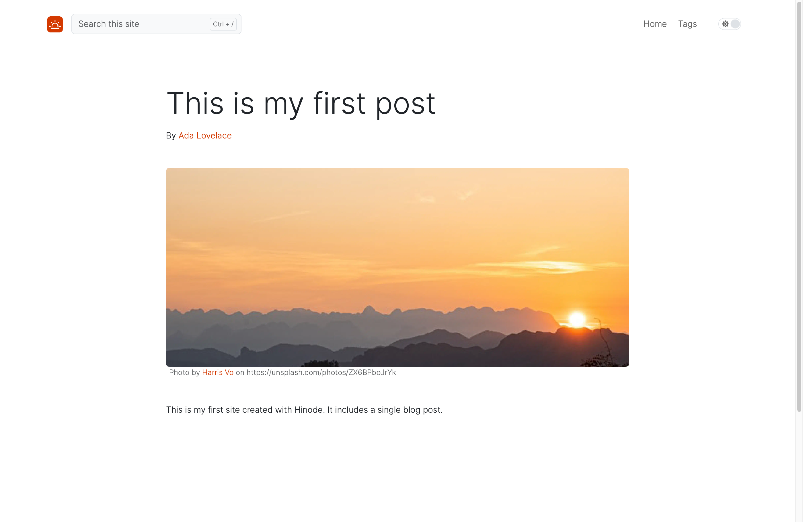
Add type: blog and an author field to the frontmatter of content/posts/first-post.md:
---
type: blog
author: Ada Lovelace
---
Note
The
postsfolder name does not automatically set the Hugo type —type:must be set explicitly in the frontmatter. Hugo uses the directory name as the section, which is separate from the type used for template lookup.
Creating the Custom Header
Create layouts/blog/header.html with the following content. It renders the page title and, when present, an author line:
{{ with .Title }}<p class="display-4 mt-5">{{ . }}</p>{{ end }}
{{ with .Params.author }}
  {{- $authorPage := $.Site.GetPage (printf "/contacts/%s" (urlize .)) -}}
  <div class="border-bottom mb-3">By {{ if $authorPage }}<a href="{{ $authorPage.Permalink }}">{{ . }}</a>{{ else }}{{ . }}{{ end }}</div>
{{ end }}
<p class="lead mb-5">{{ .Description }}</p>
The template uses Hugo’s Site.GetPage to look up the contact page for the author. The urlize function converts the author name to a URL-safe slug — "Ada Lovelace" becomes "ada-lovelace" — matching the contact page path. If no contact page exists the name is rendered as plain text.
Save the file and open the first post in your browser. It should now display a linked author name beneath the title. Any other posts without type: blog continue to use the default header.
Step 2 - Creating a Custom Content Type Layout
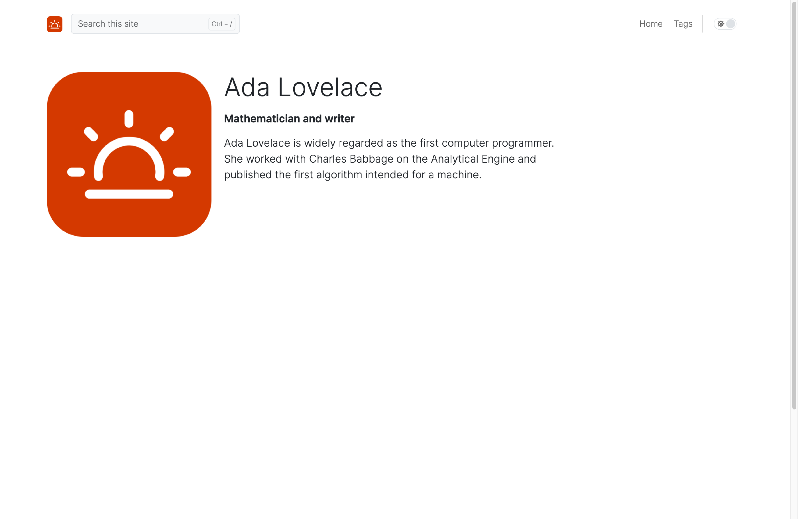
In the previous step we overrode a single layout element. In this step we will go further and define a fully custom layout for a new content type called contact. The contact type renders a profile page that shows a responsive two-column layout on larger screens and a stacked layout on smaller screens.
Adding a Contact Page
Create the folder content/contacts/ and add a file content/contacts/ada-lovelace.md with the following content:
---
title: Ada Lovelace
description: Mathematician and writer
type: contact
thumbnail: /img/logo512x512.png
---

Ada Lovelace is widely regarded as the first computer programmer.
She worked with Charles Babbage on the Analytical Engine
and published the first algorithm intended for a machine.
Note
Hinode supports both a plain string and a nested object for
thumbnail. The path/img/logo512x512.pngis available from the Hinode theme — replace it with any square image of your choice.
Creating the Single Page Template
Create layouts/contact/single.html. This template defines the main block and controls the overall page structure. On smaller screens it shows the thumbnail separately above the content; on larger screens the two-column layout is handled by body.html:
{{ define "main" -}}
    {{- $breakpoint := $.Scratch.Get "breakpoint" -}}
    {{- $padding := partial "utilities/GetPadding.html" -}}
    {{- $thumbnail := .Params.thumbnail -}}
    {{- if reflect.IsMap $thumbnail }}{{- $thumbnail = $thumbnail.url -}}{{- end -}}

    {{ .Render "header" }}

    <div class="container-xxl px-{{ $padding.x }} px-xxl-0 py-{{ $padding.y }} d-{{ $breakpoint.current }}-none">
        {{- partial "assets/live-image.html" (dict
            "src" $thumbnail
            "ratio" "1x1"
            "class" "rounded"
            "wrapper" "col-6 mx-auto"
            "title" .Title
        ) -}}
    </div>

    <div class="container-xxl flex-fill px-{{ $padding.x }} px-xxl-0">
        <div class="row row-cols-1 row-cols-{{ $breakpoint.current }}-2">
            <div class="col col-{{ $breakpoint.current }}-9">
                {{ .Render "body" }}
            </div>
        </div>
    </div>
{{ end -}}
Creating the Header Template
Create layouts/contact/header.html. This renders the contact’s name and role on smaller viewports. The desktop layout handles these inside the body column:
{{- $breakpoint := $.Scratch.Get "breakpoint" -}}
{{- $padding := partial "utilities/GetPadding.html" -}}

<div class="container-xxl p-{{ $padding.x }} px-xxl-0 d-{{ $breakpoint.current }}-none mt-5">
    {{ with .Title }}<p class="display-5">{{ . }}</p>{{ end }}
    {{ with .Description }}<p class="lead"><strong>{{ . }}</strong></p>{{ end }}
</div>
Creating the Body Template
Create layouts/contact/body.html. On desktop this shows the thumbnail, name, role, and content side by side. On mobile only the content body is rendered (the thumbnail is already shown by single.html above):
{{- $breakpoint := $.Scratch.Get "breakpoint" -}}
{{- $padding := partial "utilities/GetPadding.html" -}}
{{- $thumbnail := .Params.thumbnail -}}
{{- if reflect.IsMap $thumbnail }}{{- $thumbnail = $thumbnail.url -}}{{- end -}}

<div class="d-none d-{{ $breakpoint.current }}-block my-{{ $padding.y }} pt-{{ $padding.y }}">
    <div class="row">
        <div class="col-4">
            {{- partial "assets/live-image.html" (dict
                "src" $thumbnail
                "ratio" "1x1"
                "class" "rounded"
                "title" .Title
            ) -}}
        </div>
        <div class="col-8">
            {{ with .Title }}<p class="display-5">{{ . }}</p>{{ end }}
            {{ with .Description }}<p class="lead"><strong>{{ . }}</strong></p>{{ end }}
            {{ with .Content }}<div class="lead mb-5 mt-3">{{ . }}</div>{{ end }}
        </div>
    </div>
</div>

<div class="d-{{ $breakpoint.current }}-none">
    {{ with .Content }}<div class="lead mb-5 mt-3">{{ . }}</div>{{ end }}
</div>
Navigate to /contacts/ada-lovelace/ in your browser. The contact page should display a two-column layout with the profile photo alongside the text on wider screens:
Conclusion
In this guide we have customized the appearance of a Hinode site using two complementary techniques. We overrode a single layout element using the type-based template lookup, and defined a fully custom layout for a new content type. The Layout Documentation provides more context about the available options and Hinode’s layout conventions.